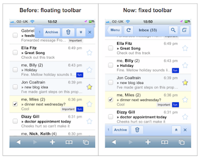
Go to gmail.com from your iPhone and you’ll notice two improvements we’ve rolled out over the past few weeks. First, scrolling is snappier: the speed of scrolling reflects the speed of your swipe gesture. This is helpful for long conversations where a few quick flicks will get you to the information you need much faster than before. Second, the toolbars stay on screen while you’re scrolling rather than moving down into view after each scroll. Being able to access your toolbars from any point on the page should make it easier to triage your email and move around the app.

If you use Gmail in your mobile browser a lot, you may have noticed that we recently tried several different variations of these buttons. We‘ve iterated on the design and made improvements based on your feedback. If you have more suggestions, please post them in our forum, or if you use Twitter, mention #gmailmobile and we'll take a look. If you’re a developer and are interested in learning about the Javascript and HTML techniques we used to do this, we’ll post an article to code.google.com/mobile in the coming weeks.
You can see these improvements by visiting gmail.com from the browser of iPhone and iPod touch devices running iOS4 (English-only for now). And if you like Gmail in mobile Safari, make getting to it easier by tapping the “+” at the bottom of the screen and then “Add to Home Screen.” (Don’t see the new changes yet? Try clearing your cache and refreshing the page.)
No comments:
Post a Comment