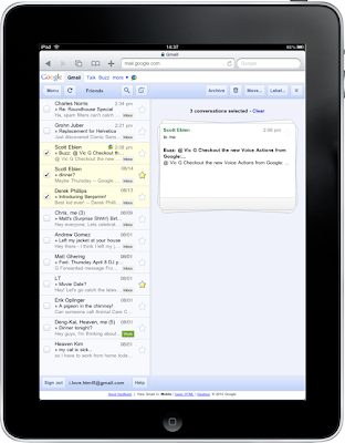
When we announced our new interface for Gmail on the iPad, we requested feedback on how we could improve this experience for tablet devices. In June, we responded with a new compose screen. Today, we’re addressing the top feedback by launching a new “stacked card” interface for selecting and managing multiple conversations.

In the past, performing actions on selected conversations was awkward. There were two similar toolbars on the screen: one on the bottom left and the other on the top right. The former affected the selected conversations, while the latter affected the currently open conversation. Since the toolbars’ buttons looked similar, it was easy to mistakenly use the wrong toolbar. Sound confusing? It was.
In the new interface, selected conversations are displayed stacked on the right panel for easy organizing, archiving or deleting. The second toolbar is gone so it’s always clear which conversations you’re working with.
This new interface has also been an opportunity for our team to experiment with CSS3 transitions, which give mobile web applications a similar look and feel to native applications. More details on the implementation are posted on the code blog.
To try the Gmail webapp on the iPad, just go to gmail.com in Safari. For quick access, create a homescreen link. Please note that the new interface is only available in US English for now.
No comments:
Post a Comment