New Google Search experience for tablets

(Cross-posted on the Inside Search blog)

As part of our effort to evolve the Google design and experience, we’ve improved the www.google.com search experience on tablets. We’ve simplified the layout of search results pages and increased the size of page contents like text, buttons and other touch targets to make it faster and easier to browse and interact with search results in portrait or landscape view.

The search button located below the search box provides quick access to specific types of results like Images, Videos, Places, Shopping and more. Just tap to open the search menu and select an option to see results in one category.


For image results, we focused on improvements that enhance the viewing experience such as enlarged image previews, continuous scroll, and faster loading of image thumbnails.


This improved search experience is rolling out in the coming days to iPad and Android 3.1+ tablets across 36 languages. Give it a try by going to www.google.com in your tablet’s browser.

Custom Class Loading in Dalvik

[This post is by Fred Chung, who’s an Android Developer Advocate — Tim Bray]

The Dalvik VM provides facilities for developers to perform custom class loading. Instead of loading Dalvik executable (“dex”) files from the default location, an application can load them from alternative locations such as internal storage or over the network.

This technique is not for every application; In fact, most do just fine without it. However, there are situations where custom class loading can come in handy. Here are a couple of scenarios:

  • Big apps can contain more than 64K method references, which is the maximum number of supported in a dex file. To get around this limitation, developers can partition part of the program into multiple secondary dex files, and load them at runtime.

  • Frameworks can be designed to make their execution logic extensible by dynamic code loading at runtime.

We have created a sample app to demonstrate the partitioning of dex files and runtime class loading. (Note that for reasons discussed below, the app cannot be built with the ADT Eclipse plug-in. Instead, use the included Ant build script. See Readme.txt for detail.)

The app has a simple Activity that invokes a library component to display a Toast. The Activity and its resources are kept in the default dex, whereas the library code is stored in a secondary dex bundled in the APK. This requires a modified build process, which is shown below in detail.

Before the library method can be invoked, the app has to first explicitly load the secondary dex file. Let’s take a look at the relevant moving parts.

Code Organization

The application consists of 3 classes.

  • com.example.dex.MainActivity: UI component from which the library is invoked

  • com.example.dex.LibraryInterface: Interface definition for the library

  • com.example.dex.lib.LibraryProvider: Implementation of the library

The library is packaged in a secondary dex, while the rest of the classes are included in the default (primary) dex file. The “Build process” section below illustrates how to accomplish this. Of course, the packaging decision is dependent on the particular scenario a developer is dealing with.

Class loading and method invocation

The secondary dex file, containing LibraryProvider, is stored as an application asset. First, it has to be copied to a storage location whose path can be supplied to the class loader. The sample app uses the app’s private internal storage area for this purpose. (Technically, external storage would also work, but one has to consider the security implications of keeping application binaries there.)

Below is a snippet from MainActivity where standard file I/O is used to accomplish the copying.

  // Before the secondary dex file can be processed by the DexClassLoader,
// it has to be first copied from asset resource to a storage location.
File dexInternalStoragePath = new File(getDir("dex", Context.MODE_PRIVATE),
SECONDARY_DEX_NAME);
...
BufferedInputStream bis = null;
OutputStream dexWriter = null;

static final int BUF_SIZE = 8 * 1024;
try {
bis = new BufferedInputStream(getAssets().open(SECONDARY_DEX_NAME));
dexWriter = new BufferedOutputStream(
new FileOutputStream(dexInternalStoragePath));
byte[] buf = new byte[BUF_SIZE];
int len;
while((len = bis.read(buf, 0, BUF_SIZE)) > 0) {
dexWriter.write(buf, 0, len);
}
dexWriter.close();
bis.close();

} catch (. . .) {...}

Next, a DexClassLoader is instantiated to load the library from the extracted secondary dex file. There are a couple of ways to invoke methods on classes loaded in this manner. In this sample, the class instance is cast to an interface through which the method is called directly.

Another approach is to invoke methods using the reflection API. The advantage of using reflection is that it doesn’t require the secondary dex file to implement any particular interfaces. However, one should be aware that reflection is verbose and slow.

  // Internal storage where the DexClassLoader writes the optimized dex file to
final File optimizedDexOutputPath = getDir("outdex", Context.MODE_PRIVATE);

DexClassLoader cl = new DexClassLoader(dexInternalStoragePath.getAbsolutePath(),
optimizedDexOutputPath.getAbsolutePath(),
null,
getClassLoader());
Class libProviderClazz = null;
try {
// Load the library.
libProviderClazz =
cl.loadClass("com.example.dex.lib.LibraryProvider");
// Cast the return object to the library interface so that the
// caller can directly invoke methods in the interface.
// Alternatively, the caller can invoke methods through reflection,
// which is more verbose.
LibraryInterface lib = (LibraryInterface) libProviderClazz.newInstance();
lib.showAwesomeToast(this, "hello");
} catch (Exception e) { ... }

Build Process

In order to churn out two separate dex files, we need to tweak the standard build process. To do the trick, we simply modify the “-dex” target in the project’s Ant build.xml.

The modified “-dex” target performs the following operations:

  1. Create two staging directories to store .class files to be converted to the default dex and the secondary dex.

  2. Selectively copy .class files from PROJECT_ROOT/bin/classes to the two staging directories.

          <!-- Primary dex to include everything but the concrete library
    implementation. -->
    <copy todir="${out.classes.absolute.dir}.1" >
    <fileset dir="${out.classes.absolute.dir}" >
    <exclude name="com/example/dex/lib/**" />
    </fileset>
    </copy>
    <!-- Secondary dex to include the concrete library implementation. -->
    <copy todir="${out.classes.absolute.dir}.2" >
    <fileset dir="${out.classes.absolute.dir}" >
    <include name="com/example/dex/lib/**" />
    </fileset>
    </copy>
  3. Convert .class files from the two staging directories into two separate dex files.

  4. Add the secondary dex file to a jar file, which is the expected input format for the DexClassLoader. Lastly, store the jar file in the “assets” directory of the project.

        <!-- Package the output in the assets directory of the apk. -->
    <jar destfile="${asset.absolute.dir}/secondary_dex.jar"
    basedir="${out.absolute.dir}/secondary_dex_dir"
    includes="classes.dex" />

To kick-off the build, you execute ant debug (or release) from the project root directory.

That’s it! In the right situations, dynamic class loading can be quite useful.

Catch the London Underground with Google Maps


Today, Google Maps added public transport directions for London within Google Maps, including Google Maps for mobile on iOS, Blackberry, and Android-powered devices. Now, whether you live in London or are just visiting, you can get public transport directions on your mobile device.


Public transport directions in Google Maps for Android


Google Maps for mobile uses your current location to determine the best trip to your destination. Just search for your destination location, select it on the map and choose the “Directions” option. The suggested trips will be based on your location by default, and provide you multiple alternatives whenever possible.

If you’re using an Android-powered device, you can also get public transport directions with Transit Navigation (Beta) in Google Maps. With this feature, you’ll get alerts when it’s time to get off the bus or train at your destination or to make a transfer. We hope that public transport directions in London make getting around town more convenient!

Google Maps 5.8 for Android adds photo uploads, My Places, and more


Today, Google Maps 5.8 for Android improves Places and Latitude with:
  • Upload photos for a Place
  • My Places as a simple way to manage the Places you’ve starred and recently viewed
  • Descriptive terms for Places in search results
  • Add a new Place on-the-go when checking in
Photo upload for a Place

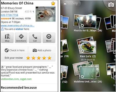
When deciding on a place to go, people often want to know what a place looks like in addition to seeing ratings and reviews. You can now contribute photos to help others get a sense of places. You can now attach your photos to Places, and yours may even become the profile picture for that page. If you want to view or delete any photos you’ve contributed to Places, you can manage uploaded photos in the “Photos for Google Maps” album on your Picasa account.

Left: Uploading pictures to a place. Right: Photos in Android Gallery

My Places and descriptive terms for mobile

In June we announced descriptive terms and ‘My Places’ for the desktop. Both these features are now in Google Maps for mobile. Descriptive terms appear in search results for Places to inform you what businesses are ‘known for,’ such as their ‘eggs benedict’ or being ‘worth the wait.’

Also, My Places for mobile provides quick access to starred and recent Place pages you’ve looked at. You can access My Places by pressing your phone’s menu button while in Google Maps.

Descriptive terms and My Places in Google Maps for mobile

Add a new Place ‘on-the-go’ for check-ins

If you’re out and about and want to check in, we want to make sure you can quickly add a new Place to check into if one isn’t available. This might happen for new businesses or those that haven’t set up a Place page yet. For example, let’s say you’re at Xoogle Xtreme Sports, a new sports shop in your neighborhood. You go to check in but don’t see Xoogle in the list of places to check into and when you do a search still nothing comes up.

Add a Place when checking in, if needed

To solve this, you’ll now see an “Add place” option at the bottom of suggested places. Select that option, and you’ll be prompted to confirm the name and location of the new place. Then a brand new place is added (and you’re checked in). This place will be available for you and others to check into from Latitude, but will not appear as a search result in Google Maps or Google Places.

We’ve also added ‘Bigger text’ to our experimental Labs features and ‘Download map area’ has been renamed ‘Pre-cache map area.’

To start using Google Maps 5.8 for Android, download the update here. This update requires an Android OS 2.1+ device and can be used anywhere Google Maps is currently available. Learn more in our help center.

New Tools For Managing Screen Sizes

[This post is by Dianne Hackborn and a supporting cast of thousands; Dianne’s fingerprints can be found all over the Android Application Framework — Tim Bray]


Android 3.2 includes new tools for supporting devices with a wide range of screen sizes. One important result is better support for a new size of screen; what is typically called a “7-inch” tablet. This release also offers several new APIs to simplify developers’ work in adjusting to different screen sizes.

This a long post. We start by discussing the why and how of Android “dp” arithmetic, and the finer points of the screen-size buckets. If you know all that stuff, you can skip down to “Introducing Numeric Selectors” to read about what’s new. We also provide our recommendations for how you can do layout selection in apps targeted at Android 3.2 and higher in a way that should allow you to support the maximum number of device geometries with the minimum amount of effort.

Of course, the official write-up on Supporting Multiple Screens is also required reading for people working in this space.

Understanding Screen Densities and the “dp”

Resolution is the actual number of pixels available in the display, density is how many pixels appear within a constant area of the display, and size is the amount of physical space available for displaying your interface. These are interrelated: increase the resolution and density together, and size stays about the same. This is why the 320x480 screen on a G1 and 480x800 screen on a Droid are both the same screen size: the 480x800 screen has more pixels, but it is also higher density.

To remove the size/density calculations from the picture, the Android framework works wherever possible in terms of "dp" units, which are corrected for density. In medium-density ("mdpi") screens, which correspond to the original Android phones, physical pixels are identical to dp's; the devices’ dimensions are 320x480 in either scale. A more recent phone might have physical-pixel dimensions of 480x800 but be a high-density device. The conversion factor from hdpi to mdpi in this case is 1.5, so for a developer's purposes, the device is 320x533 in dp's.

Screen-size Buckets

Android has included support for three screen-size “buckets” since 1.6, based on these “dp” units: “normal” is currently the most popular device format (originally 320x480, more recently higher-density 480x800); “small” is for smaller screens, and “large” is for “substantially larger” screens. Devices that fall in the “large” bucket include the Dell Streak and original 7” Samsung Galaxy Tab. Android 2.3 introduced a new bucket size “xlarge”, in preparation for the approximately-10” tablets (such as the Motorola Xoom) that Android 3.0 was designed to support.

The definitions are:

  • xlarge screens are at least 960dp x 720dp.


  • large screens are at least 640dp x 480dp.


  • normal screens are at least 470dp x 320dp.


  • small screens are at least 426dp x 320dp. (Android does not currently support screens smaller than this.)


Here are some more examples of how this works with real screens:

  • A QVGA screen is 320x240 ldpi. Converting to mdpi (a 4/3 scaling factor) gives us 426dp x 320dp; this matches the minimum size above for the small screen bucket.


  • The Xoom is a typical 10” tablet with a 1280x800 mdpi screen. This places it into the xlarge screen bucket.


  • The Dell Streak is a 800x480 mdpi screen. This places it into the bottom of the large size bucket.


  • A typical 7” tablet has a 1024x600 mdpi screen. This also counts as a large screen.


  • The original Samsung Galaxy Tab is an interesting case. Physically it is a 1024x600 7” screen and thus classified as “large”. However the device configures its screen as hdpi, which means after applying the appropriate ⅔ scaling factor the actual space on the screen is 682dp x 400dp. This actually moves it out of the “large” bucket and into a “normal” screen size. The Tab actually reports that it is “large”; this was a mistake in the framework’s computation of the size for that device that we made. Today no devices should ship like this.


Issues With Buckets

Based on developers’ experience so far, we’re not convinced that this limited set of screen-size buckets gives developers everything they need in adapting to the increasing variety of Android-device shapes and sizes. The primary problem is that the borders between the buckets may not always correspond to either devices available to consumers or to the particular needs of apps.

The “normal” and “xlarge” screen sizes should be fairly straightforward as a target: “normal” screens generally require single panes of information that the user moves between, while “xlarge” screens can comfortably hold multi-pane UIs (even in portrait orientation, with some tightening of the space).

The “small” screen size is really an artifact of the original Android devices having 320x480 screens. 240x320 screens have a shorter aspect ratio, and applications that don’t take this into account can break on them. These days it is good practice to test user interfaces on a small screen to ensure there are no serious problems.

The “large” screen size has been challenging for developers — you will notice that it encompases everything from the Dell Streak to the original Galaxy Tab to 7" tablets in general. Different applications may also reasonably want to take different approaches to these two devices; it is also quite reasonable to want to have different behavior for landscape vs. portrait large devices because landscape has plenty of space for a multi-pane UI, while portrait may not.

Introducing Numeric Selectors

Android 3.2 introduces a new approach to screen sizes, with the goal of making developers' lives easier. We have defined a set of numbers describing device screen sizes, which you can use to select resources or otherwise adjust your UI. We believe that using these will not only reduce developers’ workloads, but future-proof their apps significantly.

The numbers describing the screen size are all in “dp” units (remember that your layout dimensions should also be in dp units so that the system can adjust for screen density). They are:

  • width dp: the current width available for application layout in “dp” units; changes when the screen switches orientation between landscape and portrait.


  • height dp: the current height available for application layout in “dp” units; also changes when the screen switches orientation.


  • smallest width dp: the smallest width available for application layout in “dp” units; this is the smallest width dp that you will ever encounter in any rotation of the display.


Of these, smallest width dp is the most important. It replaces the old screen-size buckets with a continuous range of numbers giving the effective size. This number is based on width because that is fairly universally the driving factor in designing a layout. A UI will often scroll vertically, but have fairly hard constraints on the minimum space it needs horizontally; the available width is also the key factor in determining whether to use a phone-style one-pane layout or tablet-style multi-pane layout.

Typical numbers for screen width dp are:

  • 320: a phone screen (240x320 ldpi, 320x480 mdpi, 480x800 hdpi, etc).


  • 480: a tweener tablet like the Streak (480x800 mdpi).


  • 600: a 7” tablet (600x1024).


  • 720: a 10” tablet (720x1280, 800x1280, etc).


Using the New Selectors

When you are designing your UI, the main thing you probably care about is where you switch between a phone-style UI and a tablet-style multi-pane UI. The exact point of this switch will depend on your particular design — maybe you need a full 720dp width for your tablet layout, maybe 600dp is enough, or 480dp, or even some other number between those. Either pick a width and design to it; or after doing your design, find the smallest width it supports.

Now you can select your layout resources for phones vs. tablets using the number you want. For example, if 600dp is the smallest width for your tablet UI, you can do this:

res/layout/main_activity.xml           # For phones
res/layout-sw600dp/main_activity.xml # For tablets

For the rare case where you want to further customize your UI, for example for 7” vs. 10” tablets, you can define additional smallest widths:

res/layout/main_activity.xml           # For phones
res/layout-sw600dp/main_activity.xml # For 7” tablets
res/layout-sw720dp/main_activity.xml # For 10” tablets

Android will pick the resource that is closest to the device’s “smallest width,” without being larger; so for a hypothetical 700dp x 1200dp tablet, it would pick layout-sw600dp.

If you want to get fancier, you can make a layout that can change when the user switches orientation to the one that best fits in the current available width. This can be of particular use for 7” tablets, where a multi-pane layout is a very tight fit in portrait::

res/layout/main_activity.xml          # Single-pane
res/layout-w600dp/main_activity.xml # Multi-pane when enough width

Or the previous three-layout example could use this to switch to the full UI whenever there is enough width:

res/layout/main_activity.xml                 # For phones
res/layout-sw600dp/main_activity.xml # Tablets
res/layout-sw600dp-w720dp/main_activity.xml # Large width

In the setup above, we will always use the phone layout for devices whose smallest width is less than 600dp; for devices whose smallest width is at least 600dp, we will switch between the tablet and large width layouts depending on the current available width.

You can also mix in other resource qualifiers:

res/layout/main_activity.xml                 # For phones
res/layout-sw600dp/main_activity.xml # Tablets
res/layout-sw600dp-port/main_activity.xml # Tablets when portrait

Selector Precedence

While it is safest to specify multiple configurations like this to avoid potential ambiguity, you can also take advantage of some subtleties of resource matching. For example, the order that resource qualifiers must be specified in the directory name (documented in Providing Resources) is also the order of their “importance.” Earlier ones are more important than later ones. You can take advantage of this to, for example, easily have a landscape orientation specialization for your default layout:

res/layout/main_activity.xml                 # For phones
res/layout-land/main_activity.xml # For phones when landscape
res/layout-sw600dp/main_activity.xml # Tablets

In this case when running on a tablet that is using landscape orientation, the last layout will be used because the “swNNNdp” qualifier is a better match than “port”.

Combinations and Versions

One final thing we need to address is specifying layouts that work on both Android 3.2 and up as well as previous versions of the platform.

Previous versions of the platform will ignore any resources using the new resource qualifiers. This, then, is one approach that will work:

res/layout/main_activity.xml           # For phones
res/layout-xlarge/main_activity.xml # For pre-3.2 tablets
res/layout-sw600dp/main_activity.xml # For 3.2 and up tablets

This does require, however, that you have two copies of your tablet layout. One way to avoid this is by defining the tablet layout once as a distinct resource, and then making new versions of the original layout resource that point to it. So the layout resources we would have are:

res/layout/main_activity.xml           # For phones
res/layout/main_activity_tablet.xml # For tablets

To have the original layout point to the tablet version, you put <item> specifications in the appropriate values directories. That is these two files:

res/values-xlarge/layout.xml
res/values-sw600dp/layout.xml

Both would contain the following XML defining the desired resource:

<?xml version="1.0" encoding="utf-8"?>
<resources>
<item type="layout" name="main_activty">
@layout/main_activity_tablet
</item>
</resources>

Of course, you can always simply select the resource to use in code. That is, define two or more resources like “layout/main_activity” and “layout/main_activity_tablet,” and select the one to use in your code based on information in the Configuration object or elsewhere. For example:

public class MyActivity extends Activity {
@Override protected void onCreate(Bundle savedInstanceState) {
super.onCreate();

Configuration config = getResources().getConfiguration();
if (config.smallestScreenWidthDp >= 600) {
setContentView(R.layout.main_activity_tablet);
} else {
setContentView(R.layout.main_activity);
}
}
}

Conclusion

We strongly recommend that developers start using the new layout selectors for apps targeted at Android release 3.2 or higher, as we will be doing for Google apps. We think they will make your layout choices easier to express and manage.

Furthermore, we can see a remarkably wide variety of Android-device form factors coming down the pipe. This is a good thing, and will expand the market for your work. These new layout selectors are specifically designed to make it straightforward for you to make your apps run well in a future hardware ecosystem which is full of variety (and surprises).

Find nearby deals with Google Shopper 1.5 for iPhone

(Cross-posted on the Google Commerce Blog)

We’ve recently made a few new changes to Google Shopper for iPhone that makes it easy to find nearby deals when you’re on-the-go.

In the latest version of Google Shopper, in addition to the ‘Shop’ tab, you’ll now see two new tabs at the bottom of the app: Offers and My Offers. The Offers tab displays a list, or map view, of nearby offers which businesses have submitted through Google Places - from restaurant and movie theater deals to discounts on tennis lessons or a round of golf.

Let's say you come across an offer for free dessert at a nearby restaurant, but you won't have time to use it until the weekend. You can save the offer for future use, then later view and redeem it from the My Offers tab.

Additionally, if Google Offers are available in your city, you’ll be able to view and redeem your purchased offers on the My Offers tab. Google Offers are currently available in Portland, Oregon, the San Francisco Bay Area and New York, with other cities to follow.


Google Shopper 1.5 is currently available for iPhone users in the US and UK with iOS 4.0 and higher. If you’re a current Google Shopper user, you’ll automatically receive an update. Download Google Shopper 1.5 by visiting the App Store. To download Google Shopper for Android, visit Android Market.

Multiple APK Support in Android Market

[This post is by Eric Chu, Android Developer Ecosystem. —Dirk Dougherty]

At Google I/O we announced our plans to add several new capabilities to help developers manage their products more effectively in Android Market. We’re pleased to let you know that the latest of those, multiple APK support, is now available. Multiple APK support is a new publishing option in Android Market for those developers who want extra control over distribution.

Until now, each product listing on Android Market has included a single APK file, a universal payload that is deliverable to all eligible devices — across all platform versions, screen sizes, and chipsets. Broad distribution of a single APK works very well for almost all applications and has the advantage of simplified product maintenance.

With multiple APK support, you can now upload multiple versions of an APK for a single product listing, with each one addressing a different subset of your customers. These APKs are complete, independent APKs that share the same package name, but contain code and resources to target different Android platform versions, screen sizes, or GL texture-compression formats. When users download or purchase your app, Android Market chooses the right APK to deliver based on the characteristics of the device.

When you upload multiple APK files, Android Market handles them as part of a single product listing that aggregates the app details, ratings, and comments across the APKs. All users who browse your app’s details page see the same product with the same description, branding assets, screenshots, video, ratings, and comments. Android Market also aggregates the app’s download statistics, reviews, and billing data across all of the APKs.

Multiple APK support gives you a variety of ways to control app distribution. For example, you could use it to create separate APKs for phones and tablets under the same product listing. You could also use it to take advantage of new APIs or new hardware capabilities without impacting your existing customer base.

To support this new capability, we’ve updated the Developer Console to include controls for uploading and managing APKs in a product listing — we encourage you to take a look. If you’d like to learn more about how multiple APK support works, please read the developer documentation. As always, please feel free to give us feedback on the feature through the Market Help Center.

Nexus S Comes to AT&T

Since launching Nexus S with Samsung, T-Mobile and Sprint customers have enjoyed the pure Google experience, running the latest Android releases and Google mobile apps. Today we’re excited to announce a Nexus S device optimized for AT&T, available in Best Buy stores this weekend.

Nexus S runs Android 2.3 and features a 4” Super AMOLED screen, a 1 GHz processor for showing 3D graphics, front and rear facing cameras and support for NFC. It also features the latest Google mobile apps, including Google Earth, Google Maps with Navigation, Google Talk with video chat, Google Voice and Voice Actions, as well as access to more than 250,000 apps in Android Market.

Nexus S for AT&T will be available in Best Buy stores starting July 24. For those of you who just can’t wait, it’s on pre-sale today in Best Buy stores.

You can find more information at google.com/nexus or follow @googlenexus on Twitter for the latest Nexus S updates. And if you need something to pass the time until you can get your hands on one, try our Nexus Contraptions game, where you can bubble, bounce, and bump apps into the phone.


Updated 1:09pm 7/21/2011: Pre-sales are currently only available in Best Buy stores, not on www.bestbuy.com. 

Posted by Hiroshi Lockheimer, Director of Engineering

Debugging Android JNI with CheckJNI

[This post is by Elliott Hughes, a Software Engineer on the Dalvik team — Tim Bray]

Although most Android apps run entirely on top of Dalvik, some use the Android NDK to include native code using JNI. Native code is harder to get right than Dalvik code, and when you have a bug, it’s often a lot harder to find and fix it. Using JNI is inherently tricky (there’s precious little help from the type system, for example), and JNI functions provide almost no run-time checking. Bear in mind also that the developer console’s crash reporting doesn’t include native crashes, so you don’t even necessarily know how often your native code is crashing.

What CheckJNI can do

To help, there’s CheckJNI. It can catch a number of common errors, and the list is continually increasing. In Gingerbread, for example, CheckJNI can catch all of the following kinds of error:

  • Arrays: attempting to allocate a negative-sized array.

  • Bad pointers: passing a bad jarray/jclass/jobject/jstring to a JNI call, or passing a NULL pointer to a JNI call with a non-nullable argument.

  • Class names: passing anything but the “java/lang/String” style of class name to a JNI call.

  • Critical calls: making a JNI call between a GetCritical and the corresponding ReleaseCritical.

  • Direct ByteBuffers: passing bad arguments to NewDirectByteBuffer.

  • Exceptions: making a JNI call while there’s an exception pending.

  • JNIEnv*s: using a JNIEnv* from the wrong thread.

  • jfieldIDs: using a NULL jfieldID, or using a jfieldID to set a field to a value of the wrong type (trying to assign a StringBuilder to a String field, say), or using a jfieldID for a static field to set an instance field or vice versa, or using a jfieldID from one class with instances of another class.

  • jmethodIDs: using the wrong kind of jmethodID when making a Call*Method JNI call: incorrect return type, static/non-static mismatch, wrong type for ‘this’ (for non-static calls) or wrong class (for static calls).

  • References: using DeleteGlobalRef/DeleteLocalRef on the wrong kind of reference.

  • Release modes: passing a bad release mode to a release call (something other than 0, JNI_ABORT, or JNI_COMMIT).

  • Type safety: returning an incompatible type from your native method (returning a StringBuilder from a method declared to return a String, say).

  • UTF-8: passing an invalid Modified UTF-8 byte sequence to a JNI call.

If you’ve written any amount of native code without CheckJNI, you’re probably already wishing you’d known about it. There’s a performance cost to using CheckJNI (which is why it isn’t on all the time for everybody), but it shouldn’t change the behavior in any other way.

Enabling CheckJNI

If you’re using the emulator, CheckJNI is on by default. If you’re working with an Android device, use the following adb command:

adb shell setprop debug.checkjni 1

This won’t affect already-running apps, but any app launched from that point on will have CheckJNI enabled. (Changing the property to any other value or simply rebooting will disable CheckJNI again.) In this case, you’ll see something like this in your logcat output the next time each app starts:

D Late-enabling CheckJNI

If you don’t see this, your app was probably already running; you just need to force stop it and start it again.

Example

Here’s the output you get if you return a byte array from a native method declared to return a String:

W JNI WARNING: method declared to return 'Ljava/lang/String;' returned '[B'
W failed in LJniTest;.exampleJniBug
I "main" prio=5 tid=1 RUNNABLE
I | group="main" sCount=0 dsCount=0 obj=0x40246f60 self=0x10538
I | sysTid=15295 nice=0 sched=0/0 cgrp=default handle=-2145061784
I | schedstat=( 398335000 1493000 253 ) utm=25 stm=14 core=0
I at JniTest.exampleJniBug(Native Method)
I at JniTest.main(JniTest.java:11)
I at dalvik.system.NativeStart.main(Native Method)
I
E VM aborting

Without CheckJNI, you’d just die via SIGSEGV, with none of this output to help you!

New JNI documentation

We’ve also recently added a page of JNI Tips that explains some of the finer points of JNI. If you write native methods, even if CheckJNI isn’t rejecting your code, you should still read that page. It covers everything from correct usage of the JavaVM and JNIEnv types, how to work with native threads, local and global references, dealing with Java exceptions in native code, and much more, including answers to frequently-asked JNI questions.

What CheckJNI can’t do

There are still classes of error that CheckJNI can’t find. Most important amongst these are misuses of local references. CheckJNI can spot if you stash a JNIEnv* somewhere and then reuse it on the wrong thread, but it can’t detect you stashing a local reference (rather than a global reference) and then reusing it in a later native method call. Doing so is invalid, but currently mostly works (at the cost of making life hard for the GC), and we’re still working on getting CheckJNI to spot these mistakes.

We’re hoping to have more checking, including for local reference misuse, in a future release of Android. Start using CheckJNI now, though, and you’ll be able to take advantage of our new checks as they’re added.

3D buildings in Google Maps for Android arise in London, Paris, Barcelona, and more


Last December, the release of Google Maps 5.0 for Android ushered in the next-generation of mobile maps where you can rotate, tilt, and zoom in and out of 3D maps. Whether you’re on the go or playing with a new phone, seeing a 3D skyline spring up in New York City, Zurich, Milan, and other cities is a helpful, fun, and unique experience--an experience we want as many of you as we can to have for your city.

We've been adding more cities and you will now find that 3D buildings are available in London, Paris, Barcelona, Stockholm, Singapore, Lisbon, Boulder, and 11 major cities in South Africa.

3D buildings in London and Barcelona

You don’t need to update the app, just open Google Maps for mobile on your phone with Android 2.0+ and zoom in to a city with 3D buildings. Enjoy!

Android 3.2 Platform and Updated SDK tools

Today we are announcing the Android 3.2 platform, an incremental release that adds several new capabilities for users and developers. The new platform includes API changes and the API level is 13.

Here are some of the highlights of Android 3.2:

Optimizations for a wider range of tablets. A variety of refinements across the system ensure a great user experience on a wider range of tablet devices.

Compatibility zoom for fixed-sized apps. A new compatibility display mode gives users a new way to view these apps on larger devices. The mode provides a pixel-scaled alternative to the standard UI stretching, for apps that are not designed to run on larger screen sizes.

Media sync from SD card. On devices that support a removable SD card, users can now load media files directly from the SD card to apps that use them.

Extended screen support API. For developers who want more precise control over their UI across the range of Android-powered devices, the platform’s screen support API is extended with new resource qualifiers and manifest attributes, to also allow targeting screens by their dimensions.

For a complete overview of what’s new in the platform, see the Android 3.2 Version Notes.

We would also like to remind developers that we recently released new version of the SDK Tools (r12) and of the Eclipse plug-in (ADT 12). We have also updated the NDK to r6.

Visit the Android Developers site for more information about Android 3.2 and other platform versions. To get started developing or testing on the new platform, you can download it into your SDK using the Android SDK Manager.

Live traffic information for 13 European countries


Today Google Maps added live traffic coverage for 13 European countries: Austria, Belgium, Czech Republic, Denmark, Germany, Ireland, Israel, Luxembourg, Netherlands, Poland, Slovakia, Spain and Switzerland. The new traffic information will automatically be available in Google Maps for Android, iOS, and mobile browsers.

Left: Traffic layer in Munich
Right: Getting routed around traffic in Google Maps Navigation

With the addition of live traffic data, users in these countries will now also be able to be routed around traffic in Google Maps Navigation (Beta) to save precious minutes when possible.

A New Android Market for Phones

[This post is by Eric Chu, Android Developer Ecosystem. —Dirk Dougherty]

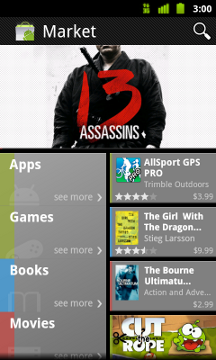
Earlier this year, we launched several important features aimed at making it easier to find great applications on Android Market on the Web. Today, we're very excited to launch a completely redesigned Android Market client that brings these and other features to phones.

The new Market client is designed to better showcase top apps and games, engage users with an improved UI, and provide a quicker path to downloading or purchasing your products. For developers, the new Android Market client means more opportunities for your products to be merchandised and purchased.

In the home screen, we've created a new promotional page that highlights top content. This page is tiled with colorful graphics that provide instant access to featured apps and games. The page also lets users find their favorite books and movies, which will help drive even more return visits to Market.

To make it fun and easy for users to explore fresh content, we've added our app lists right to the Apps and Games home pages. Users can now quickly flip through these lists by swiping right or left, checking out what other people are downloading in the Top Paid, Top Free, Top Grossing, Top New Paid, Top New Free, and Trending lists. To keep the lists fresh and relevant, we've made them country-specific for many of the top countries.


To help you convert visitors to customers, we’ve made significant changes to the app details page. We've moved the app name and price into a compact action bar at the top of the page, so that users can quickly download or purchase your app. Directly below, users can flip through screen shots by swiping right or left, or scroll down to read your app's description, what's new, reviews, and more. To help you promote your product more effectively, the page now also includes a thumbnail link to your product video which is displayed at full screen when in landscape orientation.

For users who are ready to buy, we've streamlined the click-to-purchase flow so that users can complete a purchase in two clicks from the app details page. During the purchase, users can also see a list of your other apps, to help you cross-sell your other products.

With a great new UI, easy access to app discovery lists, a convenient purchase flow, and more types of content, we believe that the new Market client will become a favorite for users and developers alike.

Watch for the new Market client coming to your phone soon. We've already begun a phased roll-out to phones running Android 2.2 or higher — the update should reach all users worldwide in the coming weeks. We encourage you to try the update as soon as you receive it. Meanwhile, check out the video below for an early look.

A new Android Market for phones, with books and movies

Recently, we’ve been hard at work improving Android Market to give you new ways to find great applications and games, purchase books, and rent movies. Today, we’re releasing a new version of Android Market which makes all of these available on phones (Android 2.2 and higher).


In the U.S., you’ll be able to rent thousands of movies, starting at $1.99, right from Android Market on your phone. With the Videos app, available in Android Market, there’s no more waiting for downloads, syncing, or worrying about storage space. Simply sign into Android Market with your Google account, and you can rent movies from anywhere – the web, or your Android phone or tablet – and start watching instantly. You can also download movies to your device so they’re available for viewing when you don’t have an internet connection.

Also in the U.S., you can now purchase books from Android Market on your phone. Like movie rentals, books are linked to your Google account, so they’re instantly available across all of your devices – computer, phone, or tablet – without the need for wires or downloads.

You’ll be delighted to find we’ve overhauled Android Market to make it faster, easier, and more fun to discover great apps, movies, and books. We’ve created more space to feature some of the most interesting content of the week on the home page. We’ve added more top charts, with newer, more relevant items, and we’ve made it easy to swipe through these charts as you browse the store. We’ve also introduced new collections of great content, like staff picks and Editors’ Choice apps.


The new Android Market will be rolling out in the coming weeks to Android 2.2 and higher phones around the world. You don’t need to do anything - the update is automatic on supported phones. If you’re in the U.S., you’ll also be able to download the Videos app, rent movies, and buy books once you receive the new Android Market.

Your phone is about to get a lot more interesting! Enjoy the new Android Market.

Finding great deals is easier with Google Shopper 2.0

Today we’re announcing a new set of features in Google Shopper for Android to make it even easier to research products and find great value deals when you’re on-the-go.

First, we’ve moved features around a bit to help you perform common tasks more quickly. For example, the ‘Starred’ and ‘History’ buttons are now at the top of the page. We’ve also added new tabs to the bottom of the screen for fast navigation to Google Shopper’s newest features.

With Google Shopper, you can now find, save and redeem offers at nearby businesses through three tabs:
  • Today’s Offer: part of the Google Offers beta program, this tab displays a single offer for discounted goods or services in your area. Today's Offer is currently available in Portland, Oregon, the San Francisco Bay Area and New York, with other cities to follow.
  • Nearby Offers: when you click this tab, you'll see offers in the 'Eat' and 'Play' categories which nearby businesses have submitted through Google Places.
  • My Offers: for those of us who occasionally misplace coupons or gloss over expiration dates, Google Shopper makes it easy to stay organized. When you come across an offer you like you can save it for later. Your saved and purchased offers appear on this tab and you can see which offers are close to expiring. To take advantage of an offer, just navigate to ‘My Offers,’ select the one you’d like, and click ‘Redeem’. In the future you’ll also be able to access and redeem your saved offers using Google Wallet.

Tap on Today’s Offer, Nearby Offers or My Offers to see great deals.


Visit Android Market to download Google Shopper 2.0, currently available for Android 2.1 and higher devices in the US and UK. If you already have the app installed you’ll automatically receive a notification to update it.

New Mode for Apps on Large Screens

[This post is by Scott Main, lead tech writer for developer.android.com. — Tim Bray]

Android tablets are becoming more popular, and we're pleased to note that the vast majority of apps resize to the larger screens just fine. To keep the few apps that don't resize well from frustrating users with awkward-looking apps on their tablets, Android 3.2 introduces a screen compatibility mode that makes these apps more usable on tablets. If your app is one of the many that do resize well, however, you should update your app as soon as possible to disable screen compatibility mode so that users experience your app the way you intend.

Beginning with Android 3.2, any app that does not target Android 3.0 (set either android:minSdkVersion or android:targetSdkVersion to “11” or higher) or does not explicitly set android:xlargeScreens="true" in the <supports-screens> element will include a button in the system bar that, when touched, allows users to select between two viewing modes on large-screen devices.

“Stretch to fill screen” is normal layout resizing (using your app’s alternative resources for size and density) and “Zoom to fill screen” is the new screen compatibility mode.

When the user enables this screen compatibility mode, the system no longer resizes your layout to fit the screen. Instead, it runs your app in an emulated normal/mdpi screen (approximately 320dp x 480dp) and scales that up to fill the screen---imagine viewing your app at the size of a phone screen then zooming in about 200%. The effect is that everything is bigger, but also more pixelated, because the system does not resize your layout or use your alternative resources for the current device (the system uses all resources for a normal/mdpi device). Here’s a comparison of what it looks like (screen compatibility mode enabled on the right):

In cases where an app does not properly resize for larger screens, this screen compatibility mode can improve the app’s usability by emulating the app’s phone-style look, but zoomed in to fill the screen on a tablet.

However, most apps (even those that don’t specifically target Honeycomb) look just fine on tablets without screen compatibility mode, due to the use of alternative layouts for different screen sizes and the framework’s flexibility when resizing layouts. Unfortunately, if you haven’t said so in your manifest file, the system doesn’t know that your application properly supports large screens. Thus, if you’ve developed your app against any version lower than Android 3.0 and do not declare support for large screens in your manifest, the system is going to offer users the option to enable screen compatibility mode.

So, if your app is actually designed to resize for large screens, screen compatibility mode is probably an inferior user experience for your app and you should prevent users from using it. The easiest way to make sure that users cannot enable screen compatibility mode for your app is to declare support for xlarge screens in your manifest file’s <supports-screens> element. For example:

<manifest ... >
<supports-screens android:xlargeScreens="true" />
...
</manifest>

That’s it! No more screen compatibility mode.

Note: If your app is specifically designed to support Android 3.0 and declares either android:minSdkVersion or android:targetSdkVersion with a value of “11” or greater, then your app is already in the clear and screen compatibility mode will not be offered to users, but adding this attribute certainly won’t hurt.

In conclusion, if your app has set the android:minSdkVersion and android:targetSdkVersion both with values less than “11” and you believe your app works well on large and xlarge screens (for example, you’ve tested on a Honeycomb tablet), you should make the above addition to your manifest file in order to disable the new screen compatibility mode.

If your app does not resize properly for large screens, then users might better enjoy your app using screen compatibility mode. However, please follow our guide to Supporting Multiple Screens so that you can also disable screen compatibility mode and provide a user experience that’s optimized for large-screen devices.

Share your docs on the go with the improved Google Docs for mobile

(Cross-posted from the Google Docs blog)

Google Docs is about collaboration, but as many of us know, others often rely on us even when we’re nowhere near a computer. That’s why we’re excited to bring the features you need to your tablet and mobile device’s browser. Today, we've updated the look of Google Docs for mobile browsers and added the ability to sort, narrow, and share multiple docs in your mobile docs list.

To get started, go to docs.google.com from your supported device’s browser. Press Sort to organize the list of docs visible in the mobile browser, or press Narrow by to specify the subset of docs you’d like to see.


To share from your mobile docs list, select one or more documents, press the Share button, and select Share, Get the link to share for public or unlisted docs, or Email as attachment. Sharing a doc in your mobile browser works the same way as it does on the desktop.


We’re committed to improving the experience of accessing your docs from your mobile device. We’d love to hear what you think is working and what isn’t in our support forums as well as in the comments of this post.

“Download map area” added to Labs in Google Maps for Android

(Cross-posted on the Official Google Blog)

One way we bring you new product features is through Google Labs—a collection of fun, experimental features you can turn on if you’re interested in the functionality. In fact, Google Maps itself started as a lab. In addition to our desktop Maps Labs, Google Maps for Android has a few tricks you can try out right from your phone. We’d like to introduce you to one new experimental feature, “Download map area," but also remind you of two other ones we already have: “Scale bar” and “Measure.”

Download map area
When you’re visiting an unfamiliar location, Google Maps for mobile is great for getting an idea of how close you are to your destination, where streets and landmarks are in relation to each other, or just for getting “un-lost.” But what if you don’t have a data signal, or you’re abroad and don’t have a data plan? We say that if you use Google Maps for mobile, you’ll never need to carry a paper map again. The “Download map area” lab in Google Maps 5.7 for Android is a step in making that statement true even when you’re offline.

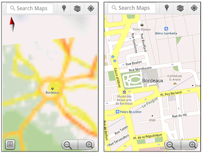
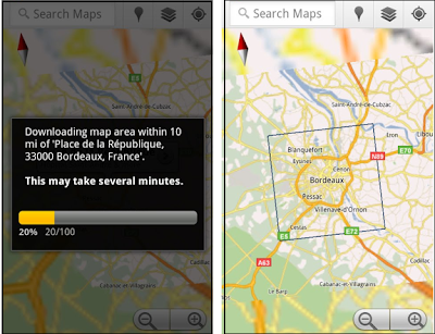
Let’s say later you’re visiting Bordeaux during a trip to France. If you were to open Google Maps for mobile and zoom into Bordeaux without data coverage or wifi, you’d see the image on the left:

Left: Bordeaux with no data or wifi. Right: Bordeaux with downloaded map area

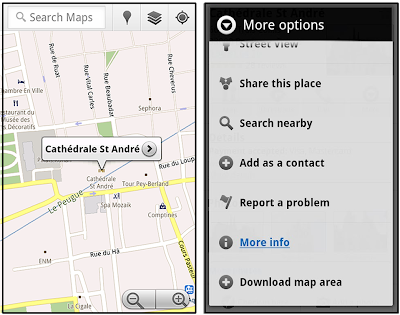
That’s not particularly useful when you’re trying to find out how close you are to the Cathedrale St. Andre. But a little advance planning and “Download map area” can help. Before you take your trip, while you still have access to WiFi or data coverage, you can open up any Places page in the world, click “More” to get the Place page menu, and download Google’s maps for a 10-mile radius.

Left: Tap a landmark to enter its Place page Right: Place page “more options” menu

The download can take as little as a minute or two. This download stores only the base map tiles and the landmarks on the map, so you still need a data connection to see satellite view and 3D buildings, search for Places and get directions. But we hope the level of detail available will help you find your way!

Left: Status screen for download. Right: Coverage of downloaded map area

All your downloaded map areas can be managed in your Google Maps cache settings so you can delete maps you no longer need or if you want to free up storage. After 30 days, all downloaded map areas will be removed from your cache; they can be re-downloaded any time.

Scale bar
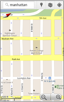
Google Maps has approximately 20 different zoom levels that range from a 2,000 mile scale to a 20 foot scale. With finger gestures making it really quick and easy to zoom in and out, sometimes it’s not always clear what zoom level you’re at. What might be just a few streets away can be quite a long walk depending on the scale. To help with this, you can turn on a scale bar, which updates based on your zoom level.

Scale bar in the lower left

Measure
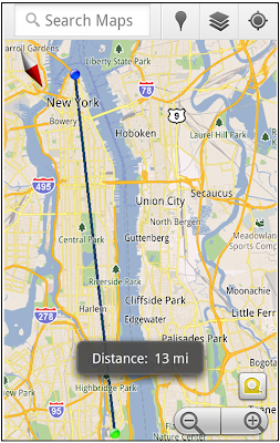
If you ever need to know the distance between San Francisco and New York (about 2602 miles) or between any other two points on the map, the “Measure” lab can help you out. Once it’s enabled, you’ll notice a tape measure icon just above the zoom buttons. After clicking that icon, you’ll be prompted to tap two points on the map and Google Maps will calculate the straight distance between those points (this direct distance is “as the crow flies”).

Example of the “Measure” Labs feature

To access Labs on your phone, press your phone’s menu button once in Google Maps, choose “More” and select Labs. On a tablet, click the menu button in the upper-right corner of Maps. The “Download map area” lab requires Android 2.1+ and the latest version of Google Maps. We look forward to bringing you more experimental features soon and hope you enjoy trying out Labs in Google Maps for Android.

Google Maps 5.7 for Android introduces Transit Navigation (Beta) and more


(Cross-posted on the Official Google Blog)

Today we’re releasing Google Maps 5.7 for Android. From Bangkok to Baltimore, we’ve added Transit Navigation (Beta), updated access to directions, better suggested search results, and a photo viewer to Place pages—all of which can help you whether you’re traveling to an unfamiliar part of town or visiting a city across the world.

Transit Navigation (Beta)
Google Maps Navigation (Beta) currently provides over 12 billion miles of GPS-guided driving and walking directions per year. Now, GPS turn-by-turn (or in this case, stop-by-stop) navigation is available for public transit directions in 400+ cities around the globe with Transit Navigation.


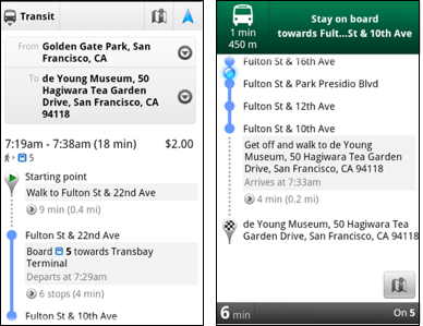
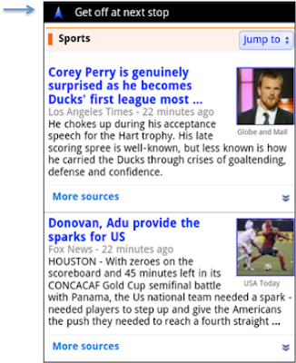
Transit Navigation uses GPS to determine your current location along your route and alerts you when it’s time to get off or make a transfer. This is particularly helpful if you’re in a city where you don’t speak the language and can’t read the route maps or understand the announcements. After starting your trip with Transit Navigation, you can open another application or put your phone away entirely and Google Maps will still display an alert in your notification bar and vibrate your phone when your stop is coming up.

Left: Transit directions without Navigation. Right: with Navigation


Navigation alerts appear even if you switch to another app

Now you can spend more time enjoying the sights out the window and less time worrying about how many stops are left, where you are along the route or whether you missed your stop. Since Transit Navigation relies on GPS signals, we recommend using this feature for above-ground transit.

Updated Directions
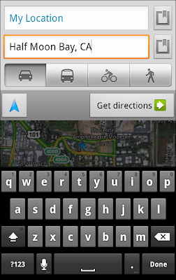
Now that we’ve improved our directions services, we wanted them to be incredibly easy to pull up on your screen. If you select the driving or walking icon and your route is supported by Google Maps Navigation, the Navigation icon will automatically appear so you can get access to step-by-step directions in one click. Note: this change is currently only in place for driving and walking and does not appear for public transit.

One-click access to Navigation from directions

We’ve also streamlined how you access directions from within a Place page. Before, clicking directions in a Place page would bring up options for “Driving Navigation,” “Walking Navigation” and “Directions.” Now, you’ll be taken straight to the map and see the new directions box shown above.

Improved Search Suggest
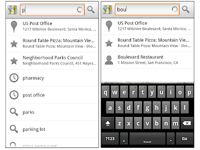
We’ve made two changes to search suggestions that improve their quality and speed. First, we’ve added category icons, so instead of all search suggestions displaying the same icon, the icon next to the listing will reflect the type of result. You’ll see a pin for a Google Places listing, a star for a starred Place or location, a clock for a previously used search term, a person for contacts and a magnifying glass for “anything else.”

Two examples of search suggest with new icons

Also, any place you got directions to or called directly from its Places page will be included as a suggestion for a relevant search. For example, if you recently received directions to the U.S. Post Office on Wilshire Boulevard, afterward, when you begin a search with [p] or [bou], that U.S. Post Office would appear as a search suggestion.

Photo viewer for Place pages
Since we released business photos for Place pages last October, millions of photos have been added to Place pages around the world. To enable you to view these photos on the run, a slick new photo viewer has been added so you can browse photos while deciding where to go.

Left: Business photos in Place pages. Right: New photo viewer

To start using Google Maps 5.7 for Android, download the update here. This update requires an Android OS 2.1+ device and works anywhere Google Maps is currently available. Learn more at our help center and have fun exploring, whether it be by car, transit, bike or foot.